
Conversion Rate Optimization Landing Page Guide That Works
Master conversion rate optimization landing page tactics with a hypothesis-driven playbook, copy and design fixes, and tests you can run tomorrow.
A paid campaign goes live. The clicks arrive. The dashboard looks healthy for a few hours, then the problem shows up. Visitors land, skim, hesitate, and leave.
That's the moment when the page design is blamed too early.
A conversion rate optimization landing page usually fails for simpler reasons. The promise in the ad doesn't match the page. The offer asks for too much too soon. The form adds friction that nobody noticed on desktop. The proof sounds nice but doesn't answer the buyer's real question, which is whether this solution works for companies like theirs.
The fix usually isn't a dramatic redesign. It's diagnosis first, then focused changes that remove the single biggest blocker.
Table of Contents
- Why Most Landing Pages Fail to Convert
- Build a Hypothesis Driven Testing Engine
- Copy and Design That Earns the Click
- Set Up Tracking Variants and QA Without Guesswork
- Proof Speed and Mobile Fixes That Actually Move Numbers
- Your Next Day Playbook and What to Test First
Why Most Landing Pages Fail to Convert
A landing page can look polished and still underperform. That happens every week in B2B and SaaS. Teams tighten the copy, swap the hero image, move a button, and still get the same disappointing result because they're treating symptoms instead of the constraint.
A better starting point is this. Judge the page on conversion outcome, not traffic volume or aesthetics. Modern benchmark data based on 41,000 landing pages, 464 million visitors, and 57 million conversions reported a 6.6% median conversion rate across industries, with major variation by category: SaaS at 3.8%, ecommerce at 4.2%, financial services at 8.3%, and events and entertainment at 12.3%. That's why a “good” landing page has to be judged in context, not against a universal target (industry landing page benchmarks).
The failure usually starts before the click
A cold paid visitor and a warm email visitor don't arrive with the same intent. That sounds obvious, but many teams still send both to one page and then wonder why the numbers feel erratic.
A webinar registration page can support a very different conversion pattern from a SaaS trial page. Historical benchmark reporting helped formalize this idea by showing that dedicated landing pages should be judged on conversion outcome, and that channel quality matters heavily. In later reporting, email-driven landing pages were reported at 19.3% average conversion and webinar-focused pages at 22.3%, far above broad all-industry medians (landing page conversion benchmark history).
Takeaway: Low conversion doesn't automatically mean the page is bad. It may mean the traffic intent, offer, and page mechanics aren't aligned.
Three common causes of underperformance
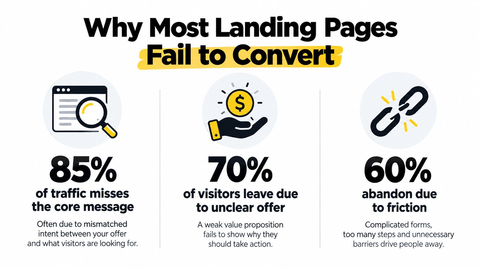
- Message mismatch: The ad promises one thing, the headline says another, and the form asks for something else. Visitors don't work to reconcile that.
- Weak offer framing: “Book a demo” often underperforms when buyers still need a reason to care. “See how finance teams reduce manual reporting” is closer to a real decision.
- Invisible friction: Extra form fields, mobile layout issues, vague CTA text, and missing trust signals quietly kill motivation.
Behavior review matters. A team looking at customer behavior analysis can often separate a traffic problem from a page problem fast. If qualified visitors consistently scroll, interact, and still stop at the form, the page is likely the bottleneck. If the traffic bounces almost immediately, the offer or targeting may be off.
What usually works better than a redesign
Most pages don't need reinvention. They need cleaner alignment.
That might mean replacing a generic hero with a headline tied to campaign intent. It might mean cutting two form fields. It might mean changing proof from anonymous praise to named customer context. It might also mean building campaign-specific pages faster so the team stops forcing one page to do five jobs. In that case, a practical resource like the Webtwizz landing page builder can help teams spin up focused variants without turning every test into a full development project.
The pages that convert well rarely win because they look more “modern.” They win because they answer the visitor's next question with less friction.
Build a Hypothesis Driven Testing Engine
Random testing burns time. It also teaches the wrong lesson because a few accidental wins can make a weak process look productive.
The better operating model is simple. Observe the bottleneck, write a tight hypothesis, prioritize by likely impact, then test with discipline.
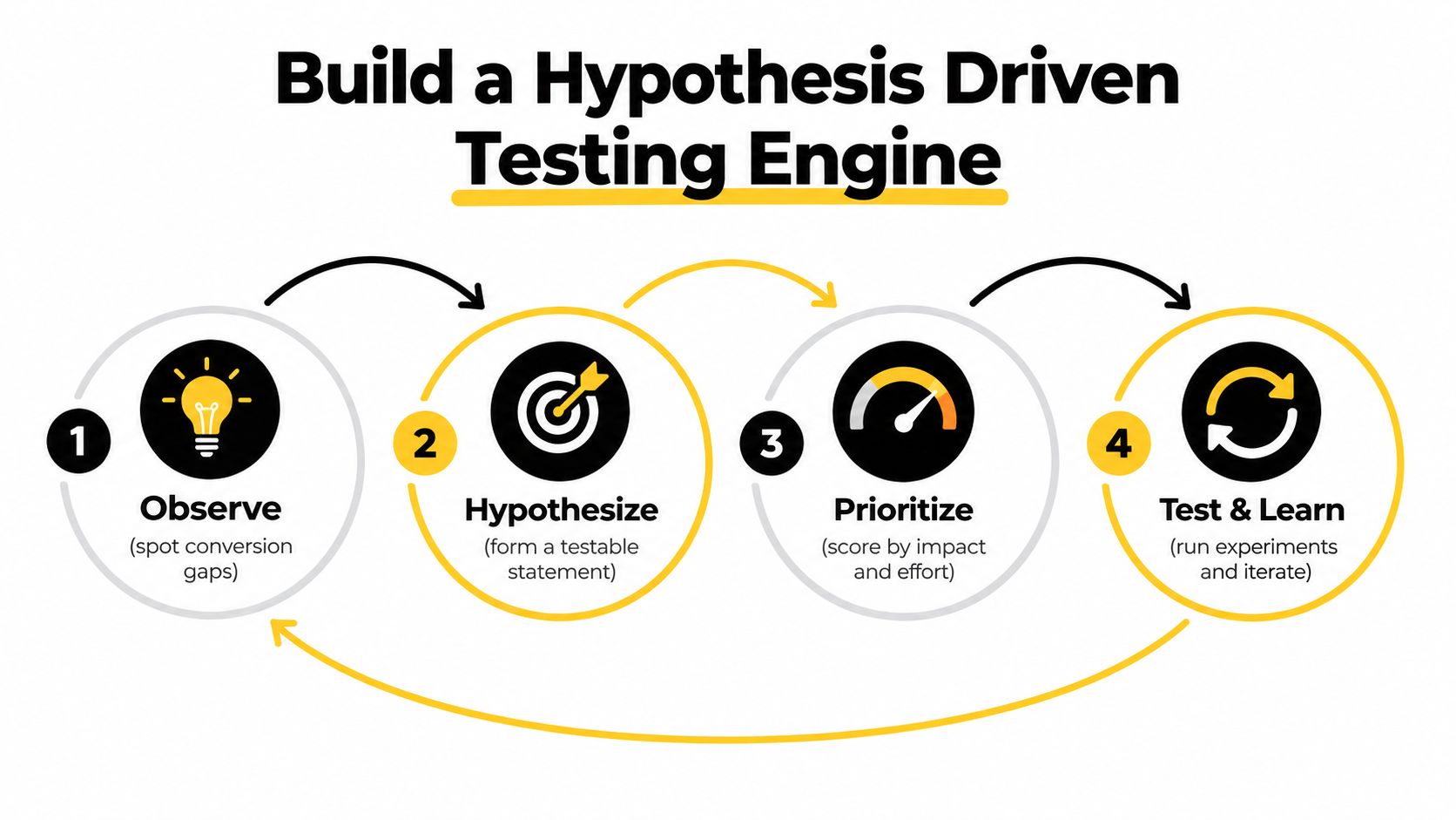
Start with the single biggest constraint
A landing page usually has one dominant problem at a time. It might be load speed. It might be a CTA that asks for commitment before trust exists. It might be mobile users missing the primary action entirely.
A/B testing program data shows why scattered testing disappoints. The median uplift from winning experiments is only +1.88% conversion rate, and median revenue-per-visitor uplift is +2.77%, which means durable gains usually come from repeated experimentation, not one heroic redesign (A/B testing benchmarks for CRO programs).
That same benchmark is useful for triage. Pages below about 2% conversion are often failing at fundamentals. Pages in the 3% to 7% band usually need more targeted tests, such as CTA clarity, social proof placement, copy compression, or field reduction.
If a page is collapsing at the fundamentals, testing button text first is mostly theater.
Write hypotheses that can fail cleanly
A useful hypothesis has three parts.
- If this specific change is made
- Then this audience will take this action more often
- Because this friction or objection is currently blocking them
Examples:
- If the hero headline mirrors the paid search query, trial starts should improve because visitors will see immediate message match.
- If the form removes the phone number field on a top-of-funnel asset, completions should improve because the perceived cost drops.
- If the page adds named customer proof next to the CTA, demo requests should improve because buyers get segment-specific reassurance at the point of hesitation.
Teams that need a structured primer on test design can use this guide to A/B testing for marketing as a working reference.
A quick explainer helps make that process visual:
<iframe width="100%" style="aspect-ratio: 16 / 9;" src="https://www.youtube.com/embed/7WrBgPygluM" frameborder="0" allow="autoplay; encrypted-media" allowfullscreen></iframe>Use a simple prioritization model
Complex scoring systems often slow down execution. A lighter model works better in practice.
Use three scores:
- Impact: How much of the funnel does this affect?
- Confidence: How strong is the evidence behind the idea?
- Effort: How hard is it to build and QA?
A page where mobile visitors can't see the primary CTA near the top should outrank a stylistic copy rewrite every time. A form friction fix should usually outrank a color change. A proof upgrade tied to buyer objections should usually outrank adding more generic testimonials.
Keep the backlog honest
A testing backlog gets better when each item includes:
- Page and audience: Who sees it, and on which traffic source
- Observed issue: The exact friction or drop-off
- Hypothesis statement: Written in plain language
- Primary metric: The one outcome that decides success
- Secondary checks: Quality signals that prevent bad wins
One practical option for teams that want this process operationalized across landing pages and funnel stages is Sprints & Sneakers, which starts by identifying the biggest bottleneck and then prioritizes experiments across acquisition and activation.
The point isn't to run more tests. It's to run fewer weak tests and more tests that attack the actual constraint.
Copy and Design That Earns the Click
Copy and design don't work as separate layers on a landing page. Visitors read the page through the layout, and they interpret the layout through the words. That's why strong pages feel obvious within seconds.
Weak pages usually ask the visitor to do interpretive work.

Above the fold needs one job
The first screen has to answer three things fast.
- What is this
- Who is it for
- Why act now
That sounds simple, but many B2B pages waste the hero on slogans. “Scale smarter” doesn't tell a buyer enough to continue. A clearer alternative is a headline tied to the buyer's use case, a subhead that explains the operational outcome, and a CTA that matches funnel stage.
Examples by page type:
- SaaS trial page: Lead with the product outcome and remove ambiguity from the CTA.
- Lead-gen page: Explain the value of the asset and who it helps before showing the form.
- Webinar page: Put the problem, speaker credibility, and immediate benefit near the signup action.
Below the fold should reduce risk, not repeat the hero
Many pages lose discipline. Instead of answering objections, they restate benefits with different phrasing.
A better below-the-fold sequence often looks like this:
- Problem clarity: Show that the company understands the operational pain.
- Mechanism: Explain how the offer works in plain terms.
- Proof: Add evidence that the solution works for similar buyers.
- Friction reduction: Make the next step feel small and safe.
Practical rule: Every section below the fold should answer a buyer question. If it only fills space, it's probably hurting clarity.
A strong messaging structure also depends on consistency. Teams refining this layer usually benefit from getting sharper on brand messaging strategy, especially when multiple campaigns are driving different audience segments to related pages.
CTA and form choices that often improve response
A CTA doesn't need to be clever. It needs to be precise.
“Submit” is vague. “Get the guide” is clearer. “See the reporting workflow” is better when the visitor needs to visualize what happens next.
Form strategy matters just as much. The shortest form doesn't always win if lead quality collapses, but most underperforming forms ask for information that isn't needed at that stage.
Common fixes that tend to help:
- Remove nonessential fields: If sales doesn't use it in the first touch, it probably doesn't belong.
- Label the value near the form: Remind visitors what they get when they complete it.
- Place reassurance beside the action: Privacy language, expectation-setting, and proof belong near the decision point.
- Design for scan paths: Strong headings, spacing, and contrast guide attention better than decorative elements.
What often fails
Several patterns show up again and again on weak conversion pages:
- Generic stock visuals that don't support the offer
- Headings that sound ambitious but say nothing concrete
- Repeated CTAs with inconsistent wording
- Long blocks of copy before any proof appears
- Mobile layouts that push the main action too far down
Good landing page design isn't about ornament. It's about helping the right visitor say yes with less cognitive effort.
Set Up Tracking Variants and QA Without Guesswork
A test isn't trustworthy if the tracking is loose, the variants are messy, or the page breaks on mobile. Smart teams protect themselves from fake wins.
The setup doesn't need to be complicated. It needs to be clean.
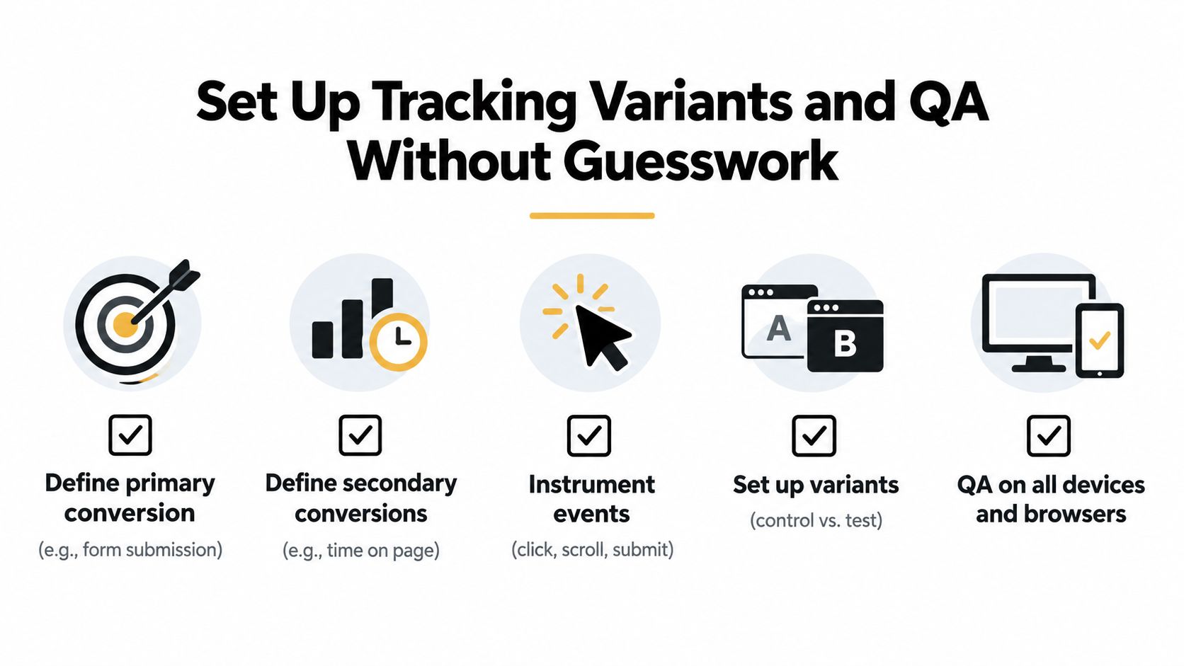
Define one primary conversion
Every landing page needs a single main outcome. For one page that might be a form submission. For another it might be a booked meeting or a trial start.
Secondary events still matter, but they can't replace the main business action. Scroll depth, CTA clicks, and engagement signals are useful diagnostics. They aren't the finish line.
That distinction gets especially important when stakeholders start celebrating a click increase that never turned into qualified pipeline.
Build variants that isolate the change
A proper test should answer one question clearly. If the team changes the headline, form length, CTA copy, and proof block all at once, it won't know which change did the work.
A cleaner workflow looks like this:
- Name the control clearly: Keep the original untouched and documented.
- Create one focused variant: Change the element tied to the hypothesis.
- Record what changed: A brief test note prevents confusion later.
- Keep traffic definitions stable: Don't move targeting mid-test unless the test is paused and reset.
For teams tightening the reporting layer, this guide on marketing tracking and analytics is a useful companion to landing page QA.
Segment before interpreting results
One of the fastest ways to misread a test is to blend traffic that should never be compared directly. A branded email click and a cold acquisition click behave differently. So do demo pages and content download pages.
The most practical benchmark guidance is to segment by traffic source and page type before drawing conclusions. A broad baseline from a large benchmark covering 41,000 landing pages, 464 million visitors, and more than 57 million conversions reported a 6.6% median conversion rate across industries, and pages above 10% are often treated as strong while 15%+ usually signals exceptional targeting or very warm traffic. That benchmark is most useful only after segmentation by source and page type.
Clean segmentation prevents bad decisions. Without it, warm traffic can hide a broken page and cold traffic can make a decent page look weak.
QA like a skeptic
Before launch, the team should act like something is broken until proven otherwise.
A lightweight QA pass should include:
- Device checks: Phone, tablet, desktop
- Browser checks: The common environments the audience uses
- Event checks: Click, submit, success state, and thank-you tracking
- Content checks: Variant copy, proof blocks, and CTA labels
- Path checks: Ad click to landing page to conversion event
Most wasted experiments don't fail because the idea was bad. They fail because the setup made the result impossible to trust.
Proof Speed and Mobile Fixes That Actually Move Numbers
Most landing page advice treats social proof like decoration and mobile optimization like a resize exercise. Both are too shallow.
What moves conversion is proof quality and mobile friction removal.
Strong proof beats generic trust badges
A lot of B2B pages drop in logo strips, one short testimonial, and a generic claim about results. That's better than nothing, but it often isn't enough to resolve risk.
A 2026 study of 2,000 pages found that named-customer proof with business context lifted conversions by 22%, outperforming logo strips at +8% and single testimonials at +14% (social proof study on 2,000 landing pages). The useful lesson isn't “add more proof.” It's “add more specific proof.”
That means:
- Naming the customer when allowed
- Explaining the business context
- Tying the proof to the same use case as the page
- Placing it near the decision point, not buried low on the page
Mobile friction is still underestimated
Responsive design isn't the same as mobile-ready conversion design.
Recent 2026 summaries report that 61.5% of web traffic is mobile, that mobile pages score materially lower than desktop pages, and that 41% of pages place the primary CTA below the mobile fold. The same summary also claims that a one-second delay in Largest Contentful Paint can cut conversions by 7%, and that pages loading in 1 second can convert 3x better than pages taking 5 seconds (mobile landing page statistics and performance summary).
That's why mobile fixes should focus on visibility and speed first:
- Put the core CTA where it appears early on small screens
- Reduce heavy elements that delay the first meaningful view
- Trim sections that force endless scrolling before action
- Keep form interactions easy for thumbs, autofill, and quick correction
For teams making technical rendering choices that affect speed and content delivery, this breakdown of server-side vs client-side rendering is relevant to landing page performance decisions.
Choosing Proof and Performance Fixes by Impact
| Lever | Typical Lift | Best When |
|---|---|---|
| Named-customer proof with business context | **+22%** based on the cited 2026 study | The page targets a specific segment and buyers need reassurance that similar companies succeeded |
| Single testimonial | **+14%** based on the cited 2026 study | The offer is simpler and the team needs a fast proof upgrade |
| Logo strip | **+8%** based on the cited 2026 study | Brand recognition matters, but detailed outcomes aren't available yet |
| Move primary CTA higher on mobile | Qualitative improvement potential | Mobile users scroll before seeing the main action |
| Improve Largest Contentful Paint | Qualitative improvement potential, with the cited summary noting speed-related conversion loss | The page feels slow, media-heavy, or unstable on mobile |
| Reduce form interaction friction on phones | Qualitative improvement potential | Mobile traffic is high and form completion is weak |
Speed is often the cheapest win
Performance fixes don't always need a major rebuild. They often start with simpler page discipline.
Google's widely cited mobile page-speed research found that when page load time goes from 1 second to 3 seconds, the probability of bounce increases by 32%, and from 1 second to 5 seconds it rises by 90% (mobile page speed and bounce research summary). That doesn't tell a team exactly which asset to remove, but it does settle the debate about whether speed belongs in the CRO backlog. It does.
Better proof lowers perceived risk. Better mobile performance lowers effort. Conversion tends to improve when both happen together.
Your Next Day Playbook and What to Test First
A strong conversion rate optimization landing page program doesn't need a grand relaunch. It needs a rhythm.
The most useful next step is a tight 30-day cycle that keeps diagnosis, testing, and iteration moving without adding complexity.
Days 1 to 5
Audit one high-value landing page only. Not five.
Review the traffic source, headline match, CTA visibility, form friction, mobile layout, and proof quality. Pick the single bottleneck that appears most likely to suppress conversion.
If audience targeting feels vague at the top of the funnel, a resource like this LinkedIn audience playbook can help sharpen who the page should speak to before new variants get built.
Days 6 to 12
Write two to three hypotheses, but launch the one with the clearest evidence behind it.
Good first tests usually fall into one of these buckets:
- Proof upgrade: Replace generic testimonials with named-customer proof and business context.
- Mobile CTA fix: Make the primary action visible earlier and easier to tap.
- Form reduction: Remove a field that creates hesitation without helping qualification.
- Message match rewrite: Align the hero with the campaign promise and audience problem.
Days 13 to 21
Run the test cleanly and watch more than the topline conversion number.
Look at conversion quality, device behavior, and traffic-source splits. A result that improves lead volume but attracts weak-fit leads may need adjustment rather than rollout.
The first win isn't the finish line. It's the clue that tells the team which objection or friction mattered most.
Days 22 to 30
Document what changed, what happened, and what to test next.
A practical closeout note should include:
- The observed bottleneck
- The exact variant change
- What improved or didn't
- Which segment responded
- What the next hypothesis should build on
Many teams lose momentum. They celebrate or dismiss a result, then fail to turn it into a system. The compounding effect comes from carrying each lesson into the next test.
A no-fluff checklist for the next landing page sprint
- Check intent first: Does the page match the traffic source promise?
- Judge the offer: Is the ask too big for the visitor's stage?
- Fix the mobile experience early: Don't leave the primary action buried.
- Upgrade proof quality: Specific evidence beats generic praise.
- Test one meaningful change at a time: Keep the result interpretable.
- Segment the readout: Don't blend warm and cold traffic.
- Iterate before rebuilding: Most pages need sharper mechanics, not a blank canvas.
The teams that get the most from landing page CRO don't chase hacks. They remove friction, sharpen proof, and keep testing the bottleneck that matters now.
Sprints & Sneakers helps growth teams find the single bottleneck holding back landing page performance, then turn that diagnosis into practical experiments across message, UX, tracking, and conversion flow. For B2B and SaaS companies that want a cleaner testing system and more reliable pipeline from existing traffic, visit Sprints & Sneakers.
Related articles
Frequently asked questions
Growth marketing, AI and automation, SEO, performance marketing, retention strategies, and sustainable business practices.
Weekly. Subscribe to our newsletter to get new articles straight to your inbox.
Absolutely. Everything we publish is designed to be actionable. Take it, test it, and make it your own.
Yes. We publish experiments with real numbers. What worked, what didn't, and what we learned.
Our growth team — strategists, performance marketers, data specialists, and AI builders who work on client campaigns every day.
We're open to it. Reach out via our contact page with your topic and we'll take a look.