
10 Landing Page Examples That Convert in 2026
10 landing page examples broken down pattern by pattern, with why each works, key tactics, and takeaways you can apply to your own pages tomorrow.
Famous landing pages get copied for their layout. Conversions come from their mechanism.
Unbounce analyzed more than 41,000 landing pages and 57 million conversions, reporting a 6.6% median conversion rate overall, 3.8% for SaaS, and 19.3% average for email visitors, according to the MarketingProfs summary of the Unbounce benchmark. Intent and message match move the number. Screenshots hide that match.
Each example below gets stripped to its mechanism. You get the pattern to copy, the part to skip, a way to use it in a different industry, and one action to ship tomorrow morning. Teams pairing these patterns with practical SaaS page optimization get more from a funnel audit, but the starting point stays simple.
Pick the pattern that matches visitor intent. Remove everything that competes with the decision. Test it against your current page. That sequence beats copying a famous layout pixel for pixel.
Table of Contents
- 1. Explainer Video Above the Fold (Dropbox, 2008)
- 2. Founder-Led Launch Video with Humor (Dollar Shave Club, 2012)
- 3. Free Tool Landing Page That Captures Leads (HubSpot Website Grader)
- 4. Email-First Signup Field (Slack Homepage Pattern)
- 5. Scroll-Based Product Story (Apple Product Pages)
- 6. Comparison Landing Page (Versus Pages)
- 7. Industrial B2B Request-for-Quote Landing Page
- 8. Gated Guide with Preview (Lead Magnet Landing Page)
- 9. Waitlist Page with Referral Mechanics
- 10. Pricing-Led Free Trial Page with Clear Tiers
- 10 Landing Page Patterns at a Glance
- Pick One Pattern, Ship It This Week
1. Explainer Video Above the Fold (Dropbox, 2008)
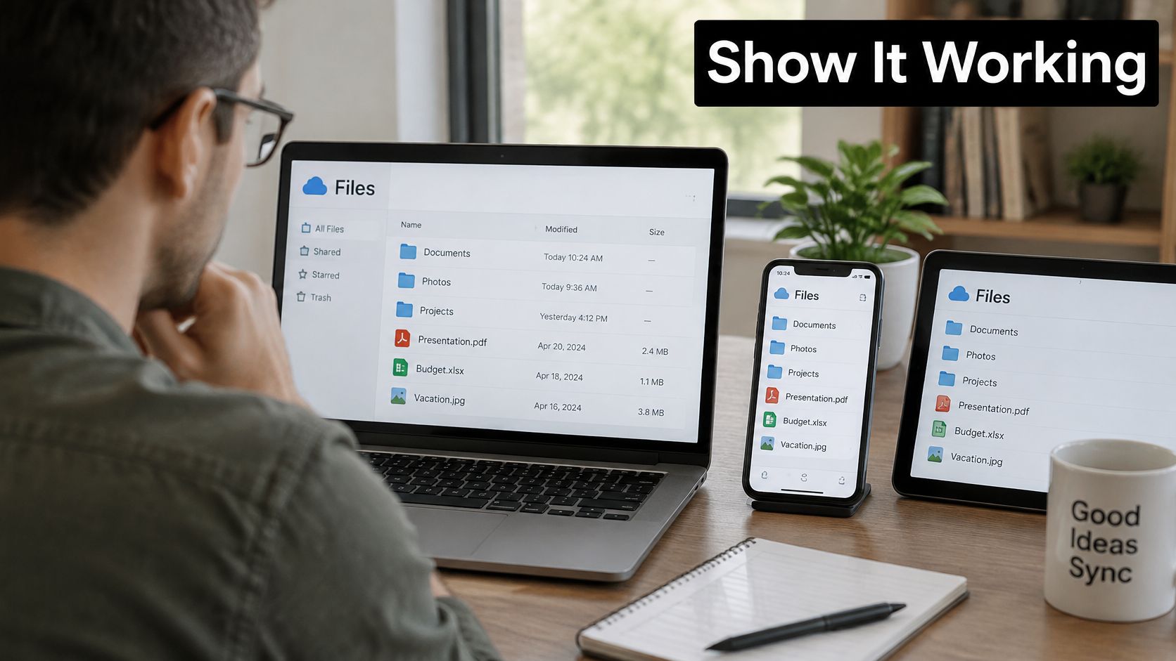
Dropbox's early page did almost nothing, and that's why it worked. A headline, a screen-recorded demo showing files syncing across devices, and a signup field. Visitors watched the product work before reading a feature list. Shared widely on Hacker News and tech blogs, the video turned an abstract idea, effortless sync, into something obvious in minutes.
Copy the Pattern, Not the Format
The transferable move is proof before pitch. A logistics platform can show a shipment getting booked. A finance tool can show an invoice reconciled. Real screen recordings beat animated mockups because buyers see the actual interface, warts included, and trust it more.
- Show the core action fast: Get to the main task in the first 15 seconds, and keep the full demo under two minutes.
- Caption everything: The video must work muted on a phone in a noisy office.
- Put signup beside the video: Burying the button in a footer wastes the moment the demo lands.
Teams refining this layout should review core landing page optimization principles before adding sections. For format inspiration, ClipCreator.ai's explainer video examples show varied styles worth testing.
Ship tomorrow: Record one real workflow on a phone or screen recorder, caption it, and place it above the fold next to the existing CTA. Pitfall: A polished brand film that never shows the product.
2. Founder-Led Launch Video with Humor (Dollar Shave Club, 2012)
One page. One low-budget video of the founder walking through a warehouse, cracking jokes, stating the price. One action, choose a subscription plan. Dollar Shave Club's 2012 launch page showed that a clear offer in a human voice can beat a polished corporate page.
The humor gets remembered, but the price in the first line did the selling. Visitors never had to hunt for the deal or decode positioning language. The page copy matched the video's tone, so the whole experience felt like one conversation instead of a video bolted onto a brochure.
Where This Pattern Travels
Founder-to-camera works anywhere trust in a person outweighs trust in a brand. A specialty coffee roaster selling office subscriptions has a conversion problem: buyers cannot taste the coffee, so per-cup price and delivery routine have to do the work. The founder films a 90-second walkthrough of the roastery, states the per-cup price up front, and points to one plan selector. Same pattern, different industry, zero razors.
- Lead with price and benefit: Both belong in the opening line, not below the fold.
- Remove main navigation: Visitors sign up or leave. Nothing else competes.
- Film cheap first: A phone test reveals whether the script works before production money gets spent.
Ship tomorrow: Script three sentences, problem, price, next step, and film them in one take. Pitfall: Jokes that bury the offer. Cut any line that delays the price.
3. Free Tool Landing Page That Captures Leads (HubSpot Website Grader)
HubSpot's Website Grader flips the usual exchange. Instead of asking for an email in return for a promise, it delivers an instant score on a visitor's own website first. The full report then asks for an email address. Value arrives before the ask, and the tool attracts search traffic from people who already suspect a problem.
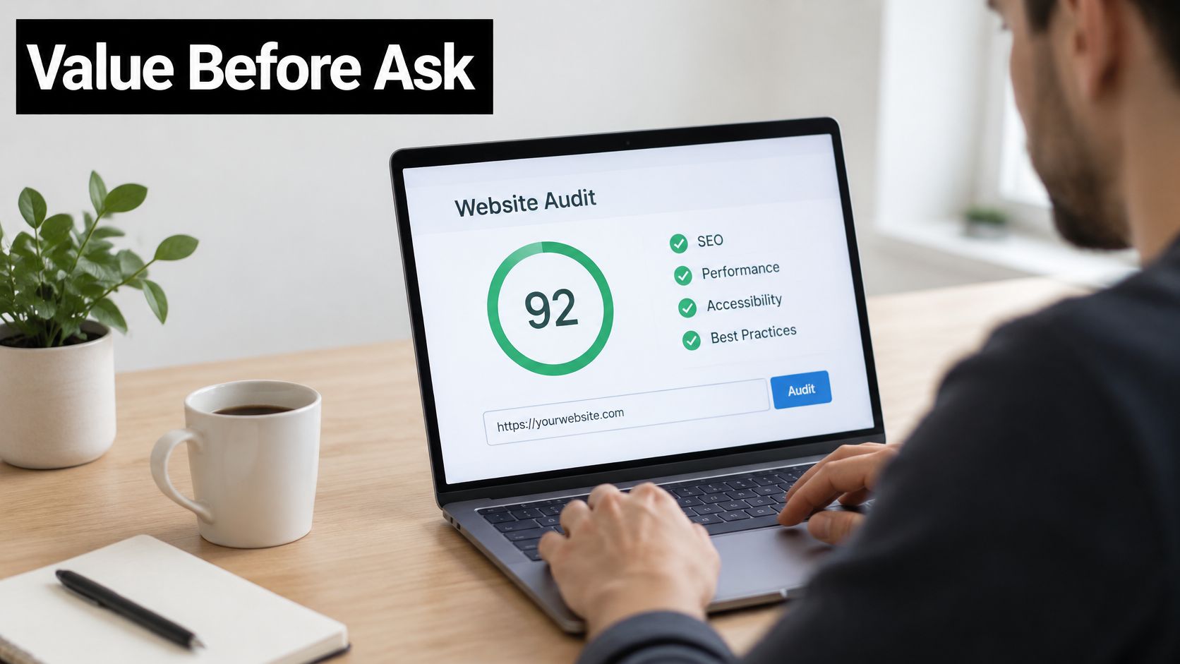
That sequencing matters for lead quality. A prospect holding a mediocre grade has a specific, personal reason to talk. The score also gives sales a concrete opening line, which a generic ebook download never does. Similar audit tools for SEO, page speed, and accessibility now anchor many B2B pipelines, and pairing them with a broader inbound lead generation strategy keeps the follow-up coherent.
A free tool converts when the result is about the visitor's own business, not the vendor's product.
- Show a sample report: Visitors should see exactly what the output looks like before entering a URL.
- Ask for email only: Every extra field before the result kills completion.
- Tie output to a next step: Each weak score should map to a consultation, fix, or trial.
- Track score to sales call: Refine the grading around results that produce pipeline.
Ship tomorrow: List five checks the target buyer runs manually, then score them in a simple form-based grader. Pitfall: A tool so generic the result could belong to anyone.
4. Email-First Signup Field (Slack Homepage Pattern)
Slack's homepage puts a single email field and one clear button right beside the headline. No plan comparison, no feature tour, no decision tree. Account creation starts in seconds, and everything else waits until after that first tiny commitment.
The pattern works because it cuts the number of decisions to one. Supporting evidence comes from Bannersnack, where Hotjar click heatmaps showed the primary call-to-action wasn't prominent enough, and a larger CTA button with stronger visual contrast increased sign-ups by 25% after iterative A/B testing, as documented in the Contentsquare guide to A/B testing examples. Prominence and simplicity compound each other.
Making One Field Do the Heavy Lifting
Button copy carries real weight here. "Start free trial" tells visitors what happens next. "Submit" tells them nothing. One line of proof under the form, a customer count or a recognizable logo, answers the trust question without adding a section. Deeper guidance on conversion rate optimization for landing pages covers how to sequence these tests.
- One field, two at most: Name, company, and password can wait for step two.
- Test on mobile first: Small screens are where cramped forms lose signups.
- Segment results by device: A desktop winner doesn't automatically transfer to mobile traffic.
Ship tomorrow: Strip the hero form to email only and enlarge the button with stronger contrast. Pitfall: Adding a second CTA of equal weight beside it.
5. Scroll-Based Product Story (Apple Product Pages)
Apple product pages work as a guided sequence. One feature per block, one large visual, one short headline, one supporting sentence. Scroll, absorb, scroll again. Complex hardware feels simple because the page never forces two ideas at once, while a buy or learn-more action stays within reach throughout.

Speed decides whether this format holds up on real phones. Google's analysis of approximately 11 million mobile advertisements across 213 countries found that as mobile load time increased from one second to ten seconds, the probability of a visitor bouncing increased by 123%, according to Google's mobile page speed benchmarks. Heavy scroll pages that ignore that result lose visitors before the story starts. Compress everything, then test on a mid-range Android device before you approve the design.
Adapting the Scroll for B2B
An engineer choosing a new sensor asks one question at a time. Will it detect at this range? Will it mount on my line? Will the output feed my PLC? Map each answer to its own scroll block with a machine photo or real screenshot, then park a spec link at the bottom for buyers who want numbers.
- One benefit per section: If a section needs two headlines, split it.
- Compress and lazy-load: Video and large images load only when scrolled into view.
Ship tomorrow: Cut one product page to five single-benefit sections and compress every image. Pitfall: Animation that delays the first meaningful content.
6. Comparison Landing Page (Versus Pages)
Comparison pages target the most valuable visitor on the internet, someone already choosing between named options. The layout is blunt. Product against competitor, row by row, across price, features, support, and setup time. No brand poetry. Just decision help at the exact moment of decision.
Message match makes these pages sharper still. A Campaign Monitor experiment used dynamic text replacement to mirror the exact wording of a visitor's search query in page copy, producing a 31.4% increase in trial conversions across 1,274 visits over 77 days, as reported in Unbounce's A/B testing examples. A versus page that echoes the searched competitor name in its headline applies the same principle.
Building a Table Buyers Believe
Credibility is the whole game. Admitting one area where the competitor wins makes every other claim more believable. Rows should come from questions sales reps hear, not from a feature list marketing wishes buyers cared about.
- Name the competitor sparingly: Headline and comparison section, not every paragraph.
- Review quarterly: Competitor pricing and features shift, and stale claims destroy trust fast.
- Measure trials, not clicks: Engagement on a versus page means nothing without pipeline behind it.
Ship tomorrow: Interview two sales reps, take their five most common competitive objections, and turn them into table rows. Pitfall: Cherry-picked rows that any informed buyer sees through.
7. Industrial B2B Request-for-Quote Landing Page
Industrial buyers don't want a brand story. They want specifications, certifications, lead times, and a quote. A request-for-quote page built for that reality puts common specs on the first screen and offers a short form capturing part numbers, quantities, delivery location, and project timing. Buyers self-qualify, and sales stops trading five emails to learn a quantity.

Form clarity is where these pages usually fail. Baymard's mobile form research found that 94% of tested sites did not consistently distinguish required from optional fields, as detailed in Baymard's mobile checkout forms research. An engineer guessing whether a phone number is mandatory is an engineer about to leave.
What the Form Should Actually Ask
Construction trades show the same logic at work. Estimators using tools like Exayard plumbing estimating software need quantities and specs structured before pricing starts, which is exactly what a disciplined quote form collects.
- Required means required: Label required fields explicitly, mark the rest optional, and show format examples beside ambiguous inputs.
- Publish a response time: "Quote within one business day" converts when the team can meet it.
- Track starts versus completions: The gap reveals which single field causes drop-off.
Ship tomorrow: Audit the quote form and delete every field sales doesn't use in the first reply. Pitfall: Asking budget questions before confirming technical fit.
8. Gated Guide with Preview (Lead Magnet Landing Page)
The gated guide is the oldest pattern on this list, and it keeps working when the offer solves a specific problem. A downloadable checklist, template, or benchmark report sits behind a short form, with a preview on the page so readers can judge quality before handing over an email. HubSpot's template library built an enormous list on exactly this exchange.
Specificity separates converters from clutter. "Pipeline checklist for B2B teams" promises a usable tool. "Marketing guide" promises homework. The preview does the persuading, a visible first page or sample section proves the content exists and clears a quality bar. Teams building a library of these offers should align them with proven lead generation techniques so each download feeds a deliberate nurture path.
Practical rule: If the preview page can't sell the guide, the guide isn't specific enough yet.
Error handling deserves attention too, since form friction hides there. The W3C's WCAG guidance states that automatically detected input errors must identify the incorrect item and describe the problem in text, per the W3C error prevention guidance. "Enter an email address in the format name@company.com" recovers signups that "Something went wrong" loses.
- Name and email only: Extra fields belong in later progressive profiling.
- Follow up within 24 hours: One useful tip plus one next step, nothing more.
Ship tomorrow: Add a real first-page preview to the best-performing guide page. Pitfall: Gating content too thin to justify the exchange.
9. Waitlist Page with Referral Mechanics
A B2B tool with two distinct buyers faces a segmentation problem before launch. Finance teams want audit trails, agency teams want client views, and one generic announcement will miss both. A waitlist page solves this by trading position in line and a unique referral link for an email plus two qualifying fields at signup. Each invited friend moves the referrer up the queue or grants early access. Several invite-only launches have used this mechanic as a core part of acquisition.
The loop only converts when early access has concrete value. Founding customer pricing, locked in for good, gives joiners a reason to share. Fake scarcity erodes that trust. A countdown that resets gets screenshotted, passed around, and the launch starts with skepticism instead of momentum.
Turning a Queue into Launch Data
Company size and use case collected at signup let launch emails split from day one. Finance gets one sequence, agencies get another, and the highest-referring accounts get onboarding calls first. A structured referral marketing strategy helps decide what reward each tier of sharing earns, so the page builds the launch plan while it collects emails.
- State a clear launch window: Vague timelines stall sharing momentum.
- Send updates every few weeks: Silence makes early joiners forget why they signed up. One progress note plus one referral reminder per update is enough.
Ship tomorrow: Add position numbers and a personal referral link to the confirmation page. Pitfall: Rewards so small nobody bothers sharing.
10. Pricing-Led Free Trial Page with Clear Tiers
Buyers ask one question first. What does it cost, and which plan fits? A pricing-led page answers on a single screen, three tiers, monthly and annual toggle, one plan labeled recommended, and the free trial sitting beside the paid options with its terms stated plainly. Qualified buyers decide faster, and support stops fielding billing questions the page should have answered.
Friction hides in what pricing pages omit. Trial length and card requirements belong directly under the main button, not in a FAQ accordion. Baymard's checkout research found that 26% of users abandon a purchase solely because the checkout process is too long or complicated, according to Baymard's checkout optimization research. A pricing page that flows into a bloated checkout wastes all its clarity.
Details That Close the Decision
Annual discounts persuade harder as dollar amounts than as percentages. "Save $240 a year" beats "Save 20%" because nobody does arithmetic mid-decision. E-commerce subscriptions apply the same logic with price per shipment and cancellation terms on the same screen.
- Three plans maximum: More tiers means more deferral, not more choice satisfaction.
- State what happens after trial: Charge date, downgrade path, and data retention in one line each.
- Keep an enterprise door open: Custom-terms buyers need a contact option, not a bigger self-serve tier.
Ship tomorrow: Add trial length and card policy under every pricing CTA. Pitfall: Hiding the recommended plan to appear neutral.
10 Landing Page Patterns at a Glance
Use this table to pick fast. Difficulty means build effort: Low ships with copy and form changes in a day, Medium needs design or weekly upkeep, High needs dev, video, or ongoing testing.
| Pattern | Best For | Primary Goal | Difficulty to Replicate | Failure mode to avoid |
|---|---|---|---|---|
| Explainer Video Above the Fold (Dropbox, 2008) | Hard to explain products | Show the product and drive signups | Medium: needs a clear, well-produced demo | Demo shows features, never the outcome |
| Founder-Led Launch Video with Humor (Dollar Shave Club, 2012) | Simple consumer offers | Make the offer memorable and generate orders | High: needs authentic personality and tight humor | Joke carries the page, price arrives late |
| Free Tool Landing Page That Captures Leads (HubSpot Website Grader) | B2B with a sharp customer problem | Deliver results and capture qualified leads | High: needs development and reliable results | Score feels generic, so nobody shares contact details |
| Email-First Signup Field (Slack Homepage Pattern) | SaaS with a fast free trial | Reduce signup friction | Low: needs a simple form and focused page | Extra fields creep back above the fold |
| Scroll-Based Product Story (Apple Product Pages) | Visual products with several benefits | Explain benefits in a guided sequence | High: needs strong design, visuals, and fast load | Heavy media slows the page on mobile |
| Comparison Landing Page (Versus Pages) | Buyers evaluating named competitors | Help high-intent visitors choose | Medium: needs fair, current comparisons | Page reads as an attack, trust drops |
| Industrial B2B Request-for-Quote Landing Page | Manufacturers and industrial suppliers | Qualify quote requests | Medium: needs technical content and form setup | Form asks for drawings before any value |
| Gated Guide with Preview (Lead Magnet Landing Page) | Teams building an email list | Exchange a resource for contact details | Low: needs a focused resource, preview, and short form | Preview hides everything, so nobody converts |
| Waitlist Page with Referral Mechanics | Pre-launch products with real early access | Build anticipation and grow an early audience | Medium: needs referral tracking and updates | Position never moves, referrals stall |
| Pricing-Led Free Trial Page with Clear Tiers | SaaS and subscription businesses | Clarify pricing and help buyers choose | Medium: needs clear packaging and billing terms | Trial terms sit in FAQ instead of under the CTA |
Pick One Pattern, Ship It This Week
Strong landing pages trade decoration for clarity. One decision per page, proof before the ask, and a next step that works even when the visitor skipped the homepage. That standard gets harder to meet as entry points multiply, with AI-referred visitors landing deep inside the site with no prior brand context.
Keep navigation on pages that serve as deep-link entry points. Those pages have to carry context, proof, and credibility in one view. I recommend splitting results by referral source for two weeks and judging the variant on completed conversions and qualified leads, not clicks alone.
Semantic headings, visible focus states, properly labeled fields, and compressed media convert visitors who would otherwise leave. Report conversion by device and by completed form step instead of one blended rate. That breakdown shows where slow connections, small screens, or assistive technology block demand that average conversion hides.
The performance audit at Sprints & Sneakers examines which funnels convert, where the audience drops off, and which messages work for competitors. A senior strategist decides which pages and topics come first, based on their effect on leads and revenue, and checks everything before it goes live. Clients describe the collaboration as "strategic, collaborative, and not afraid to course-correct," which is the posture testing demands.
Ship one variant this week. Choose the leak with the clearest cost, such as a trial page losing mobile signups or a guide page with traffic and no downloads. Build the variant, split the traffic, and let the loser get replaced fast. Start with the growth scan at Sprints & Sneakers to pinpoint the single bottleneck limiting performance, then turn one of these patterns into the next measurable conversion win.
Sprints & Sneakers helps B2B, SaaS, and e-commerce teams turn landing pages into predictable pipeline through full-funnel growth marketing, rapid experimentation, and CRO guided by revenue impact rather than guesswork. Teams ready to find out which pattern their funnel needs first can start with a personalized growth scan at Sprints & Sneakers.
Related articles
Frequently asked questions
Growth marketing, AI and automation, SEO, performance marketing, retention strategies, and sustainable business practices.
Weekly. Subscribe to our newsletter to get new articles straight to your inbox.
Absolutely. Everything we publish is designed to be actionable. Take it, test it, and make it your own.
Yes. We publish experiments with real numbers. What worked, what didn't, and what we learned.
Our growth team — strategists, performance marketers, data specialists, and AI builders who work on client campaigns every day.
We're open to it. Reach out via our contact page with your topic and we'll take a look.